

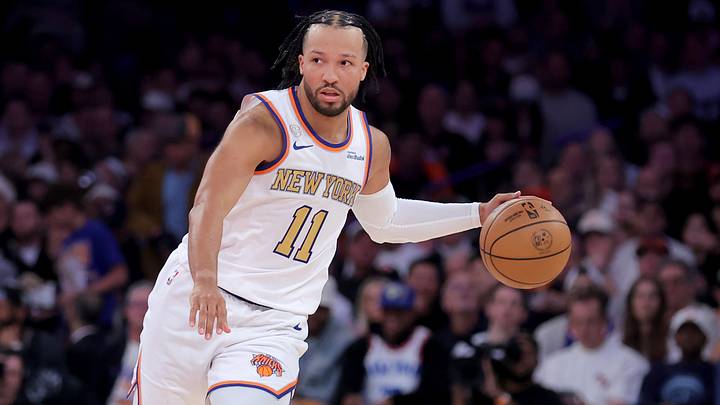
On a night fans waited 53 years to see, the New York Knicks looked different.
Not necessarily from a play standpoint, and even outside of their 106-100 loss to Philadelphia, definitely not in a positive way.
Instead, from a superficial perspective — their color scheme, specifically.
Instead of the traditional blue, orange, and white threads that have been a staple of the organization since its founding back in 1946, the Knicks added a touch of gold lettering to their uniform for their title-defending season opener.
gold standard 🪡🧵 pic.twitter.com/ojbwkLQXPf
— NEW YORK KNICKS (@nyknicks) October 20, 2026
Though perhaps unnoticeable to some and seen as a mere artistic choice by others, personally, when looking at this alternate font color, it's hard not to feel that those who decided on this uniform were a bit tone-deaf, especially given the night and all the meaning behind it.
Knicks should have strengthened meaning behind classic orange and blue
Over the years, the Knicks have been no strangers to shaking up the look of their jerseys.
From the bright orange ones donned during the Carmelo Anthony era to the predominantly black ones worn during the early days of Jalen Brunson's Big Apple tenure, New York has certainly not shied away from experimentation.
However, these attempts generally came at times when the club was actively trying to rebrand itself from a struggling, down-on-its-luck franchise to one that's on the rise.
Now, this shift when finally at the mountain top just seems to be in poor taste.
This championship has meant so much to Knicks fans not because they view the team as the new "gold standard" of the NBA, but because of the decades-long rough road it took to get back to this point.
Since the last time the Knicks hoisted a championship banner up into the rafters at MSG, they, along with their loyal fanbase, have endured countless amounts of pain.
Bernard King's chronic knee injuries; Patrick Ewing's missed finger-roll; the entire Isiah Thomas era; the entire Phil Jackson era.
All these notable nightmarish events, along with many, many others, helped spark decades' worth of consistent misery.
Yet, despite the agony felt by New York's loyal and loving fanbase, they still showed up, night in and night out, repping their crisp blue, orange, and white.
For better or worse, these colors represent the painfully beautiful history of an organization that, though inarguably has had more lows than highs, an entire fanbase never quit on.
Moving on from the classic jersey on such a momentous occasion as the Championship banner-raising and rings ceremony, while being surrounded by a sold-out crowd rocking these traditional threads, just feels wrong.
The uniform's legacy deserves to be honored, not altered!
 Add us as a preferred source on Google